Sunday, May 30, 2010

Were you born in a barn?

Janus was the god of doors.

The two-faced deity was also the god of endings and beginnings, and in the later Republic assumed the role of the overseer of war and peace.Plutarch of Chaeronea (c. 2nd Cent. AD) wrote:
"Janus also has a temple at Rome with double doors, which they call the gates of war; for the temple always stands open in time of war, but is closed when peace has come. The latter was a difficult matter, and it rarely happened, since the realm was always engaged in some war, as its increasing size brought it into collision with the barbarous nations which encompassed it round about. But in the time of Augustus it was closed, after he had overthrown Mark Antony; and before that, when Marcus Atilius and Titus Manlius were consuls, it was closed a short time; then war broke out again at once, and it was opened."
Virgil explains the meaning of the ritual closing of the gates:
The terrible iron-constricted Gates of War shall shut; and safe within them shall stay the godless and ghastly Lust of Blood, propped on his pitiless piled armory, and still roaring from gory mouth, but held fast by a hundred chains of bronze knotted behind his back.
[Aeneid, 1.293-296]
In other words: the gates were closed to keep War in.

I know that Memorial Day is supposed to be a "holiday" for "honoring" and recalling our war dead. But, frankly, the dead are dead. As a society the 21st Century United States doesn't do honor or remembrance particularly well. We're not, by and large, a retrospective - or introspective - people. Our fear of death largely prevents us from doing much real thinking about the dead as they are, instead of the fictions and romances we tell ourselves about them.So I find that most Memorial Day "memorial" ceremonies - those not simply an honest excuse to cookout and take a day off work - are poorly-disguised flag-waving exercises, where the zombie dead of past glorious wars are invoked to bless the warfighting of their descendants.The United States has never been a particularly peaceful nation. We have sent our people out to kill and die for us in foreign lands since we tried to invade Canada during the Revolution. As we are now. And just as with our dead, we do little introspection, or rumination, about the whys, the hows, the what-now, and the what-comes-after.

We're perfectly happy to pass by the open doors of the Temple of Janus.

Every year on Memorial Day I post this. But this year I'm tired of repeating what most of us here know and what most of those around us neither know nor care. Instead I humbly suggest that we let the dead bury their dead. And think of the living, and the decisions we make for them and to them.

For through those open doors will walk the dead men we'll "honor" the next last Monday in May, and left outside those doors will be the living bereft to whom they will not return.Whenever I used to walk past the open door my father would bark at me "Close the damn door! Were you born in a barn?"

My father would know what to do about the Temple of Janus.

Dumping on the intel

Scott Horton on the Gitmo task force report. I noted this because an old associate of ours is mentioned:
"The Obama Administration came to Washington promising to clean up the Bush-era detentions policy and make it conform to the clear requirements of law. Then it seems to have decided that the law wasn’t so convenient and that simply providing for unbridled executive authority à la Bush-Cheney wasn’t such a bad idea after all. In terms of Washington power politics, that decision seems to have taken the form of letting Robert Gates make the call on all these issues. The two figures in the Administration who took the most credible stance for implementing the Obama campaign-era promises on detentions policy -- Greg Craig and Phil Carter -- resigned within a few weeks of one another, offering no believable reasons for departing. Then press reports began to appear about secret prisons, operated by JSOC and DIA and applying rules different from those applied in the "normal" DOD prisons, including plenty of torture-lite techniques under Appendix M of the Army Field Manual"
I am hardly sentimental about most of the people we have swept up in these illegal rattissages. They are unlikely to have loved us before they were imprisoned and, probably, tortured, and they are even less likely to let us alone now.But this isn't about them. This is about us, and who we are, and who we want to be. We started by warring on nations that did not attack us. We proceeded from there to violate the spirit of our national charter, which explicitly forbids bills of attainder, imprisonment without cause, and torture. We have now arrived at a place where the Chief Bobo - the mere "executive" who is supposed to do nothing more than enforce the will of the People in Congress has issued orders to murder U.S. citizens.

And the nation's response? Either approval or unconcern.

We had this discussion so many times over at the old Intel Dump. Five, six, seven years have passed, and...what? The people who worried more about our national character, about the rule of law, about the fact that whilst our enemies have no capability to destroy us we can do just that without so much as a pistol shot fired are gone, and those who see no issue with donning the morals and methods of the secret prison and the legalized assassination are still in charge.

At the old Dump even those of us who felt that there WAS a good fight to fight in central Asia pretty much agreed that the whole "why do they hate us"? question was a no-brainer. They hate us when we lie about our means and methods, they hate us when we callously violate the principles we vaunt, they hate us when we murder and kidnap and imprison without evidence or trial. All the intel we have from the places we're fighting in confirm these things. They don't hate us for our "freedoms". They don't hate us for who we are. They hate us for what we do, and this is one of the most hateful.So have good intel but we prefer to dump all over it like incontinent poodles. We know better and yet we do it anyway. We have better ways and we choose to do the worse. We have the means and methods to be smarter and yet we deliberately choose to be fools. It's worse than a crime; it's a mistake, a huge, inescapable political and foreign policy mistake, and in it we are digging our own political graves, and the People seem to see nothing but a bed of flowers.

WASF.

(h/t to Glenn Greenwald)

Friday, May 28, 2010

Remember us..

Let's take some time to remember the soldiers that are here and gone this weekend. We should always remember the spirit and love of those who risk and give their lives for our country and freedom.


Spread the love, not the hate... please feel free to copy this banner and place it wherever you would like. Credit is appreciated, not expected and the only thing I ask is that you do not claim it as your own.
T♥

Saturday, May 15, 2010

Wednesday, May 12, 2010

CS5—A Pleasure to Meet You


I don’t think I’ve ever been as excited about a new software release as I am about the new Adobe Creative Suite (CS5). Two years ago a friend, one of the software engineers, told me they were working on some very cool things for this release. What an understatement! The new features are unbelievably awesome, and seeing what is now possible made me feel as though my head would explode.

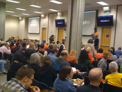
The past two days I’ve been on the Adobe campus, learning about the main components in CS5, and today, specific presentations on InDesign. Why the focus on InDesign? Tuesday was the regularly scheduled bi-monthly InDesign Users Group (IDUG) meeting, which coincidentally took place the night before the “InDesignSecrets Print and ePublishing Conference” being held here in Seattle May 12-14. (For a complete list of speakers, see: http://www.indesignsecretslive.com/speakers.html) So there were a bunch of heavy hitters in town, and we were lucky to have a few of them share some cool things with us. (Note, there are usually maybe 100 people who attend the IDUG, but there were more like 300 for this event. That’s a lot of Pagliacci pizza!)


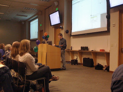
Monday, the awesome Colin Fleming, my favorite Adobe Application Engineer, did a fantastic dog and pony show for a small group of us, primarily covering InDesign, Illustrator, Photoshop and Flash Catalyst. Tuesday evening he reprised the material for a much larger audience and was met with resounding approval, oohs and ahhs.

Just a FEW of the new features:
  • The new layers palette allows you to move objects from visual order or into groups instead of toggling back and forth from the selection to direct selection tool
  • Multiple page sizes in one document!
  • Ability to track text changes (you can track change data in Indd & from Word docs) and other cool composition tools
  • New presentation mode for those who don’t get along with PowerPoint. Yes! You can create presentations from InDesign!
  • A mini-bridge runs in a Flash panel inside InDesign and Photoshop—meaning it is super easy to navigate and identify assets
  • And speaking of assets, there is a new icon on the Indd file that looks like a set of links. It will show you the links in the Indd file (Really cool! Especially if you don’t remember a file name)
  • Packaged “Fonts” folder has been renamed “Document Fonts.” Fonts in a particular document gathered at the same level as the Indd file will launch automatically. No more of the ugly pink highlight showing you missing fonts!
  • “Gridify” works with all creation tools, so you can now create and modify columns and rows instantly :-)
  • You can build threaded text frames automatically
  • Now place images that will “autofit," even when the window is scaled up/down
  • Metadata in image files can be used to automatically create captions
  • And...drum roll...going from print to digital has never been easier. If you love designing in InDesign, you can now do so while integrating animation, sound and external movie files.
After a short break, during which my iPhone had a seizure and wouldn’t allow me to check in on Foursquare (will I ever earn a “swarm” badge? she asks longingly), a few of the conference speakers started sharing useful, fun and just plain WEIRD tips and tricks.

James Wamser, Senior Training Specialist with Sells Printing Company in New Berlin, WI, showed how custom-sized pages could simplify work flow. He started with a letter-sized page, then added a skinny .25” wide page, and then added a third letter-sized page, to form a front and back cover with spine. Normally, because the spine is an unusual size, the cover would need to be created in a separate document with the front, back and spine on a single page. A great tip he gave us was to save the spine-width page variables so they are there to select for future projects.

One of the weird ones was Mike Rankin, author and manager of work flow automation at Houghton Mifflin Harcourt Publishing Co., showed us how it was possible to make a rotated page by drawing a square, rotating it, then using a toolbar button to align the page to the rotation of the square. David Blatner took it a step further by showing us we could alter the square to a parallelogram, and the page would follow suit. Why would this be a good idea? Well, it wouldn’t. It would likely drive your service providers insane. But these guys are über geeks, so of course discovering and exploiting little known “features” really blows their skirts up.

He also showed a cool trick for making interlocking links. Users of vector programs know it’s difficult to pull off, but his workaround took only a couple of minutes.


(Left to right: Mike Rankin, James Fritz and interested onlookers)

We were shown how to fake the “Ken Burns” effect in InDesign, which was really fun and funny, because James Fritz, Milwaukee-based Adobe Certified Design specialist, had to riffle through the demo laptop in search of images to use as examples and had trouble finding some. (One of the other speakers joked, “it’s in the folder... labeled “porn.”) But in the end, he was successful in showing us that it was possible to do rotation movement and enlargement while successive images faded in and out. Folks, this is InDesign!


Basically, there are just too many exciting features to focus on any one in particular. The bottom line is, I’m waiting for my CS5 Design Premium  and hope it gets here soon!

One last note: There’s still time to register for InDesign Secrets Live, and last night we were given a code: IDUGS to get “early bird pricing!” (http://www.indesignsecretslive.com/conference.html)

Wednesday, May 5, 2010

"You Get What You Pay For"

Why low graphic design prices hurt EVERYONE...

So you think you're getting a bargain by paying $10 for a logo? Most of the time, you aren't even getting an actual logo, but a graphic posing as a logo. A real logo should cost enough to represent the time, quality, and effort put into a design by the artist. What you think is a deal for a low price will end up possible costing you 10 times that in the long run. These are some things to look for when purchasing a low/high priced logo design. A good designer should be able to cater to all of these things and come to a compromise of ideas with you.

Well designed logos are made for the long haul of a business and include;

A design that incorporates your business as a whole so that it can be used whether you are only designing widgets or canned preserves! lol

Test of time meaning, is the style trendy now and it will fade out of fashion eventually? You want a designer that lives in the long term not just short fads that come and go.

Fonts that are used well and would stand alone without any graphics.

Colors that can blend into any marketing situation such as; labels, packaging, business cards, etc.
For example, if you use a white color anywhere in your logo design that will touch backgrounds eventually, are you positive that your client will always have a dark enough background for it to show up on? Or will some of the design be lost if they change their business color palettes? I repeat "LONG TERM" thought should be put into designs. Also, too many colors is always a problem. Unless you are absolutely sure you will never change a thing about your business, keep it 3 colors or less.

Graphics can be used but there are always some things to be considered. As I stated before, trends and timelessness are 2 different things. Be aware that a chick on your logo today may not be what you want in a year or more. (Yes, referring to my own logo here.) Also, too many graphics can take away from the actual company info. and this is when I call it a "graphic" not a logo. Sometimes designers play better with graphics than fonts and I completely understand this. I love graphics too and that's why I design ads, banners, etc. But a logo is a company's prime eye candy so the company name should be the most relevant to the design. Graphics should complement not overshadow.

MAKE IT LARGE! If you make your client's logo large from the start they can easily w/out to much graphic design knowledge, resize it smaller. Giving someone something small for a label logo and then expecting the client to resize for fliers is going to be a problem.

Transparent background please... .jpg is a nice format if you just want to add something to a similarly colored background or you feel you can change the background colors yourself. However, chances are if you are buying a logo you want to use it on everything. Transparent background .png is my best friend and I know my clients can easily resize and put their logo on all of their marketing materials.

I don't have all the answers heck, I mostly don't even know all the questions!! lol But I can attest to having just recently redone some of these so called "logos" where the client thought $10 would actually pay to brand their company. Usually, I have to scrap the whole thing they present me with and start fresh.

Besides the fact the client is being ripped off, we have to understand how our own actions effect the design community as a whole. If there is a talented designer out there charging well below the market price for their work, clients will then expect others to lower their prices. Each individual/job is different and we all should figure out what's comfortable to us. I don't believe in regulating prices or anything like that. However, as prices go down so does a professional reputation. It's like Wal Mart vs. Nordstrom, who do you want to design your special event wear? To be more clear, as I stated in the beginning...

"You Get What You Pay For!"

Now go spend some $$$ on graphic design services! lol

T♥

Recent logos, (not redesigned, fresh off the Photoshop).