I don’t think I’ve ever been as excited about a new software release as I am about the new Adobe Creative Suite (CS5). Two years ago a friend, one of the software engineers, told me they were working on some very cool things for this release. What an understatement! The new features are unbelievably awesome, and seeing what is now possible made me feel as though my head would explode.
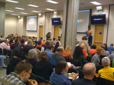
The past two days I’ve been on the Adobe campus, learning about the main components in CS5, and today, specific presentations on InDesign. Why the focus on InDesign? Tuesday was the regularly scheduled bi-monthly InDesign Users Group (IDUG) meeting, which coincidentally took place the night before the “InDesignSecrets Print and ePublishing Conference” being held here in Seattle May 12-14. (For a complete list of speakers, see: http://www.indesignsecretslive.com/speakers.html) So there were a bunch of heavy hitters in town, and we were lucky to have a few of them share some cool things with us. (Note, there are usually maybe 100 people who attend the IDUG, but there were more like 300 for this event. That’s a lot of Pagliacci pizza!)

Monday, the awesome Colin Fleming, my favorite Adobe Application Engineer, did a fantastic dog and pony show for a small group of us, primarily covering InDesign, Illustrator, Photoshop and Flash Catalyst. Tuesday evening he reprised the material for a much larger audience and was met with resounding approval, oohs and ahhs.
Just a FEW of the new features:
- The new layers palette allows you to move objects from visual order or into groups instead of toggling back and forth from the selection to direct selection tool
- Multiple page sizes in one document!
- Ability to track text changes (you can track change data in Indd & from Word docs) and other cool composition tools
- New presentation mode for those who don’t get along with PowerPoint. Yes! You can create presentations from InDesign!
- A mini-bridge runs in a Flash panel inside InDesign and Photoshop—meaning it is super easy to navigate and identify assets
- And speaking of assets, there is a new icon on the Indd file that looks like a set of links. It will show you the links in the Indd file (Really cool! Especially if you don’t remember a file name)
- Packaged “Fonts” folder has been renamed “Document Fonts.” Fonts in a particular document gathered at the same level as the Indd file will launch automatically. No more of the ugly pink highlight showing you missing fonts!
- “Gridify” works with all creation tools, so you can now create and modify columns and rows instantly :-)
- You can build threaded text frames automatically
- Now place images that will “autofit," even when the window is scaled up/down
- Metadata in image files can be used to automatically create captions
- And...drum roll...going from print to digital has never been easier. If you love designing in InDesign, you can now do so while integrating animation, sound and external movie files.
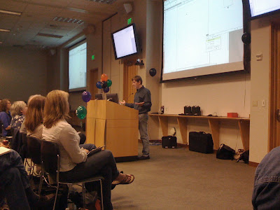
James Wamser, Senior Training Specialist with Sells Printing Company in New Berlin, WI, showed how custom-sized pages could simplify work flow. He started with a letter-sized page, then added a skinny .25” wide page, and then added a third letter-sized page, to form a front and back cover with spine. Normally, because the spine is an unusual size, the cover would need to be created in a separate document with the front, back and spine on a single page. A great tip he gave us was to save the spine-width page variables so they are there to select for future projects.
One of the weird ones was Mike Rankin, author and manager of work flow automation at Houghton Mifflin Harcourt Publishing Co., showed us how it was possible to make a rotated page by drawing a square, rotating it, then using a toolbar button to align the page to the rotation of the square. David Blatner took it a step further by showing us we could alter the square to a parallelogram, and the page would follow suit. Why would this be a good idea? Well, it wouldn’t. It would likely drive your service providers insane. But these guys are über geeks, so of course discovering and exploiting little known “features” really blows their skirts up.
He also showed a cool trick for making interlocking links. Users of vector programs know it’s difficult to pull off, but his workaround took only a couple of minutes.

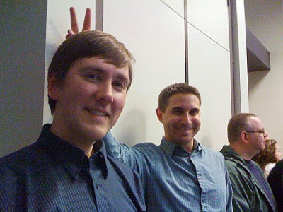
(Left to right: Mike Rankin, James Fritz and interested onlookers)
We were shown how to fake the “Ken Burns” effect in InDesign, which was really fun and funny, because James Fritz, Milwaukee-based Adobe Certified Design specialist, had to riffle through the demo laptop in search of images to use as examples and had trouble finding some. (One of the other speakers joked, “it’s in the folder... labeled “porn.”) But in the end, he was successful in showing us that it was possible to do rotation movement and enlargement while successive images faded in and out. Folks, this is InDesign!

Basically, there are just too many exciting features to focus on any one in particular. The bottom line is, I’m waiting for my CS5 Design Premium and hope it gets here soon!
One last note: There’s still time to register for InDesign Secrets Live, and last night we were given a code: IDUGS to get “early bird pricing!” (http://www.indesignsecretslive.com/conference.html)


No comments:
Post a Comment